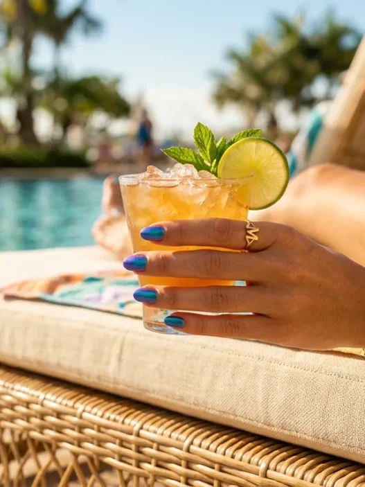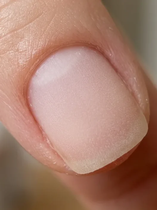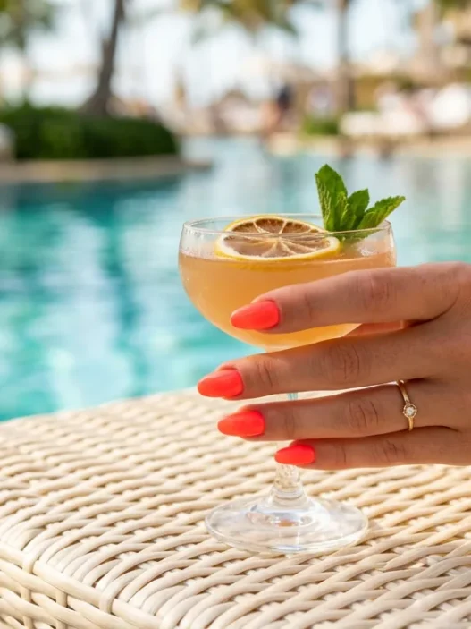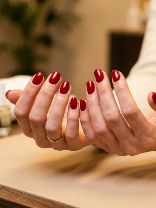





I became mildly obsessed with abstract nails sometime around the third time a client sent me a photo of her manicure and asked why it looked “flat” on her phone. She’d just left the salon. The colour was gorgeous in person — a moody violet with freehand swirls — but on camera it was reading like a bruise. That sent me down a rabbit hole I have never fully climbed out of: which abstract nail designs actually translate to a photograph, and which ones need you standing in perfect afternoon light just to look half-decent?
What follows is my honest ranked experience with twelve abstract manicure styles, specifically through the lens of how they photograph. Some of these surprised me. A couple of my personal favourites in real life are actually the worst on camera — and I’ll tell you exactly which ones.
What’s Inside: The Camera-Ready Abstract Nail Rankings
- 1. The Glazed Glass Finish (Catches Every Light)
- 2. The Ink Swirl (Reads Like Fine Art at Thumbnail Size)
- 3. The Tonal Gradient (Photographs Calmer Than It Looks)
- 4. The Bold Color Block (Never Gets Lost Under Flash)
- 5. The Pearl Detail (Always Reads Sharp on Camera)
- 6. The Negative Space Line (Deceptively Minimal, Deceptively Photogenic)
- 7. The Chrome Abstract Smear (Genuinely Shocking on Camera)
- 8. The Watercolor Wash (Soft but Surprisingly Defined)
- 9. The Squiggle Line Art (Thumbnail Tested, Approved)
- 10. The Metallic Foil Fragment (Catches Light in Weird, Beautiful Ways)
- 11. The Monochrome Geometric (The Nail That Never Needs a Filter)
1. The Glazed Glass Finish (Catches Every Light)
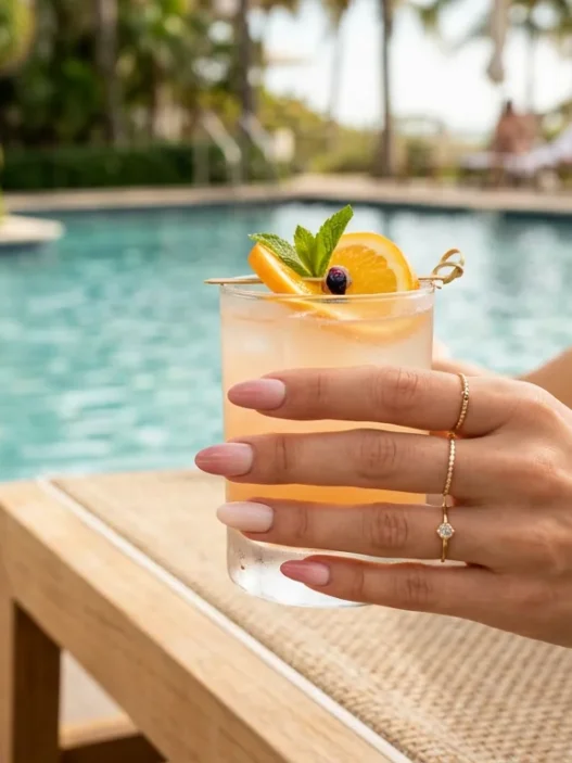
If you’re a content creator and you only do one abstract nail style this year, make it this one. The glazed glass finish — that ultra-shiny, almost wet-look topcoat applied over a sheer or nude base — photographs with an almost supernatural clarity. The reason it works so well on camera is simple: high gloss reflects light in a concentrated, directional way. Your phone’s camera doesn’t have to work hard. The highlight lands exactly where it should, every single time.
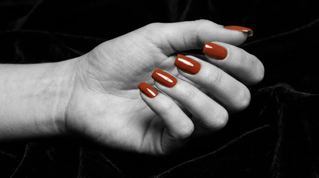
Look at how her hand sits in this photo — the dramatic side light hits the glaze and the whole nail practically glows without any editing. That’s what I mean about this finish being almost cheat-mode for photography.
You can build this over any base colour, which is the other reason I love it. Want a terracotta glaze? Done. Icy white? Even better on camera. The key is a quality high-shine topcoat — thin layers, fully cured if you’re working with gel. Skipping proper cure time is what kills the finish and, subsequently, kills the photo.
2. The Ink Swirl (Reads Like Fine Art at Thumbnail Size)
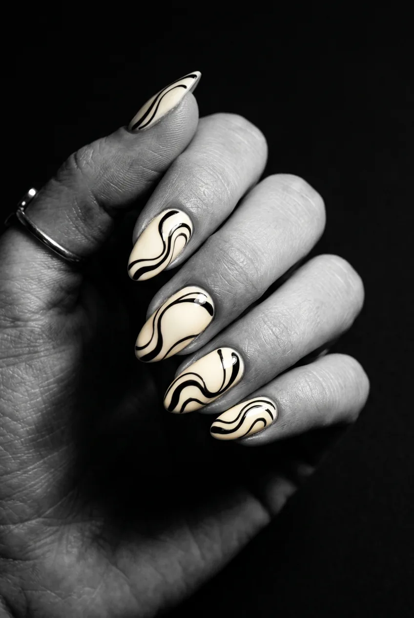
The ink swirl is one of those designs that feels almost too bold in real life — dark, fluid lines looping across a pale or neutral base — but the moment you photograph it, something clicks. The high contrast between the swirl colour and the base reads beautifully even at thumbnail size. And thumbnail size is honestly the most important size right now. Instagram grid, Pinterest board, TikTok cover — all tiny.
The technique matters here. If you’re practising freehand work, the Beginner’s Guide to Free-Hand Nail Art is genuinely one of the most useful resources I’ve found for getting smooth, confident lines without a wobbly hand panic. Swirls specifically reward a slow, deliberate movement — rushing them creates a sketchy look that the camera will absolutely notice.
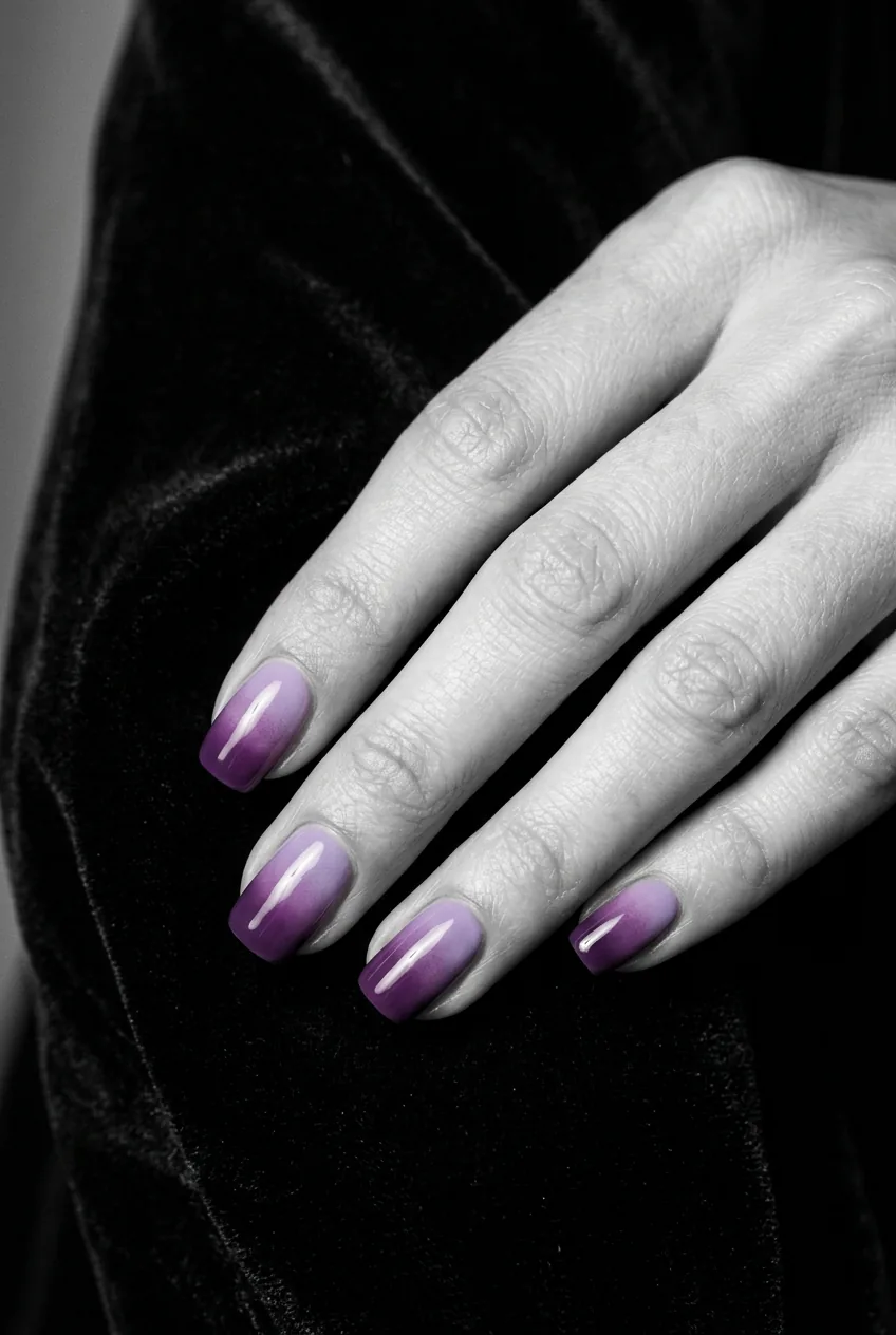
3. The Tonal Gradient (Photographs Calmer Than It Looks)
This one is interesting because the relationship between reality and camera is almost reversed. In person, a tonal gradient — two or three shades of the same hue blending across the nail — can feel quite bold. But on camera, especially under soft light, it photographs incredibly calm and polished. The colours collapse slightly into each other, giving a seamless, editorial feel.
Explore more of the best nail art designs for inspiration on colour pairings that translate well to photography — there are some genuinely unexpected combinations that work brilliantly under flash.
The counter-note: if the two tones are too close in value, the gradient effectively disappears on camera. You need at least two shades of visible contrast or the whole thing reads as a flat, single colour. Nobody needs a flat single colour. Push the gradient wider than feels comfortable in person and trust that the camera will bring it back to beautiful.
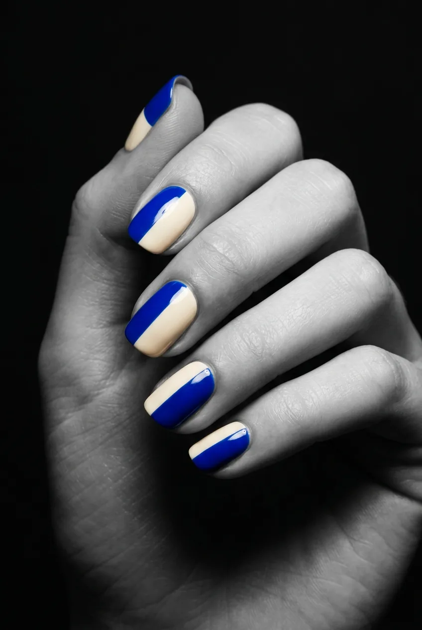
4. The Bold Color Block (Never Gets Lost Under Flash)
Flash is the enemy of subtlety. It bleaches out pastel tones, murders dusty muted colours, and makes anything with low saturation look like it wasn’t even trying. The bold colour block — a geometric division of two or three high-saturation colours across the nail — laughs in the face of flash.
The key to making this feel abstract rather than just painted sections is the edge quality. Hard, clean lines between the colour zones read as intentional and graphic. Soft, imprecise edges read as a mistake. Tape is your friend here, or a steady hand and a very fine brush. Either way, those edges need to be sharp. The camera will find every blurred boundary and broadcast it.
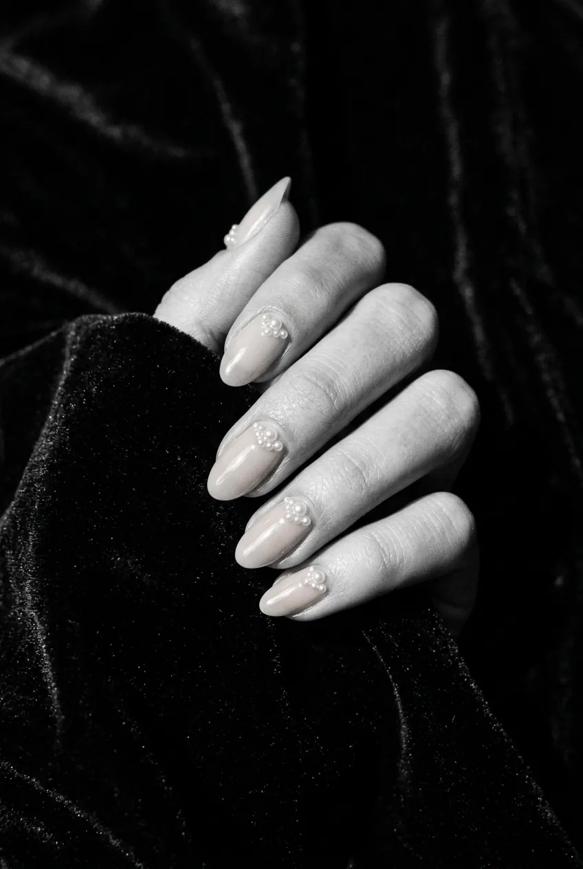
5. The Pearl Detail (Always Reads Sharp on Camera)
Pearl details — whether that’s tiny pearl beads placed near the cuticle, or a pearlescent chrome pigment buffed into an abstract shape — have a particular relationship with camera light that I find almost addictive. They catch and hold highlights in a way that creates dimension. Dimension is what separates a flat nail photo from an editorial nail photo.
See how in this image the light catches just the tip of the pearl details and creates a small but sharp highlight? That’s the thing you’re aiming for — that tiny, precise glimmer that tells the viewer there’s texture happening here. It’s not subtle, but it’s not loud either. It’s just… exactly right on camera.
6. The Negative Space Line (Deceptively Minimal, Deceptively Photogenic)
I’ll be honest — I underestimated this one. Negative space designs where thin lines of bare nail are left unpainted in abstract patterns felt almost too simple to photograph interestingly. I was wrong.
The contrast between the unpainted nail and the colour zones creates an almost graphic design quality that cameras love. On a square or squoval shape especially — check out some square squoval nail inspiration to see what I mean — those clean negative lines running parallel to the nail edges create a precise, architectural feel that genuinely looks expensive in photos.
The caveat: your nail needs to be in good condition for this to work. Ridges, dryness, or uneven surface on the natural nail will be fully exposed in those negative zones. No hiding anything here. This is a design that rewards nail care as much as nail art.
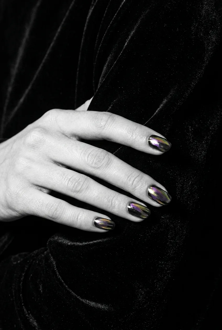
7. The Chrome Abstract Smear (Genuinely Shocking on Camera)
This is the one that surprised me most, and probably the one I recommend most aggressively to anyone building a nail portfolio right now. A chrome pigment — mirror chrome, aurora chrome, the holographic kind — applied as an abstract smear or dragged shape across a dark base creates something that cameras simply cannot ignore. It’s mirror-like. It’s reflective. It shows depth that the eye can barely process.
My personal pick for 2026 portfolio content: the aurora chrome smear on a near-black base. I’ve seen this combination stop scrolls in a way that nothing else in abstract nail art is currently doing. It’s abstract, it’s unexpected, and it photographs like nothing else. If you’re a salon owner building an Instagram portfolio, do this look, photograph it under dramatic side light, and watch what happens.
The technique for getting an abstract smear to look intentional and not accidental is everything. You can learn more about working with chrome pigments and how they behave on gel surfaces by looking into chrome nail powder technique — getting the base perfectly cured and tacky-free before applying the pigment is non-negotiable if you want that sharp, mirror result that photographs so dramatically.
The Technique Behind the Chrome Smear
8. The Watercolor Wash (Soft but Surprisingly Defined)
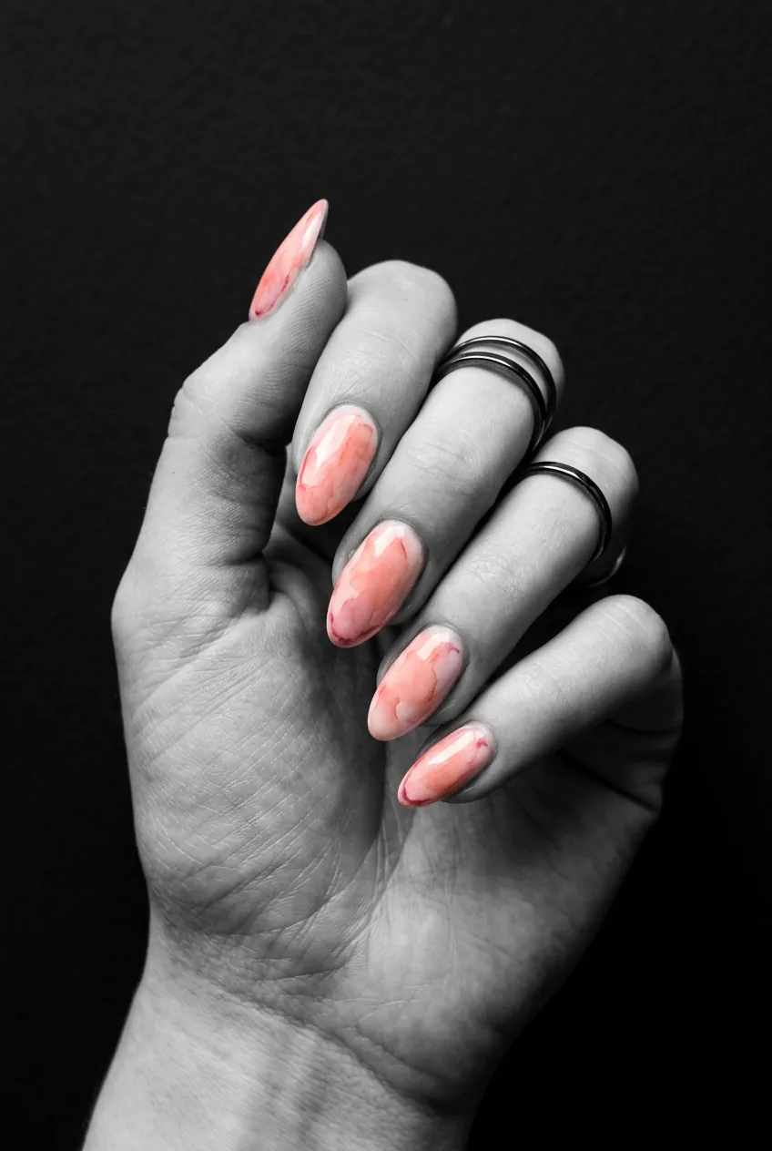
Here’s where I’d normally expect to be delivering bad news, because soft watercolor-style nail art — sheer, diluted pigment applied in loose, painterly washes — seems like exactly the kind of thing a camera would flatten into nothing. But when it’s done well, the layering of translucent colour creates a depth that actually reads beautifully, particularly in natural light photography.
The trick is the edges. A watercolor wash that bleeds all the way to a hard edge creates a contrast the camera can latch onto. Blend soft in the middle, keep the boundary defined. The result looks like actual watercolor paper — which is a genuinely beautiful thing to have on someone’s hands.
This doesn’t photograph as well as you’d think: the fully translucent, barely-there watercolor look with no contrast edges. When the whole nail is one soft wash with no definition, cameras tend to compress the whole thing into a vaguely tinted nail. You need contrast somewhere — even just a single darker edge or a deliberate watermark shape within the wash — to give the camera something to hold onto.
9. The Squiggle Line Art (Thumbnail Tested, Approved)
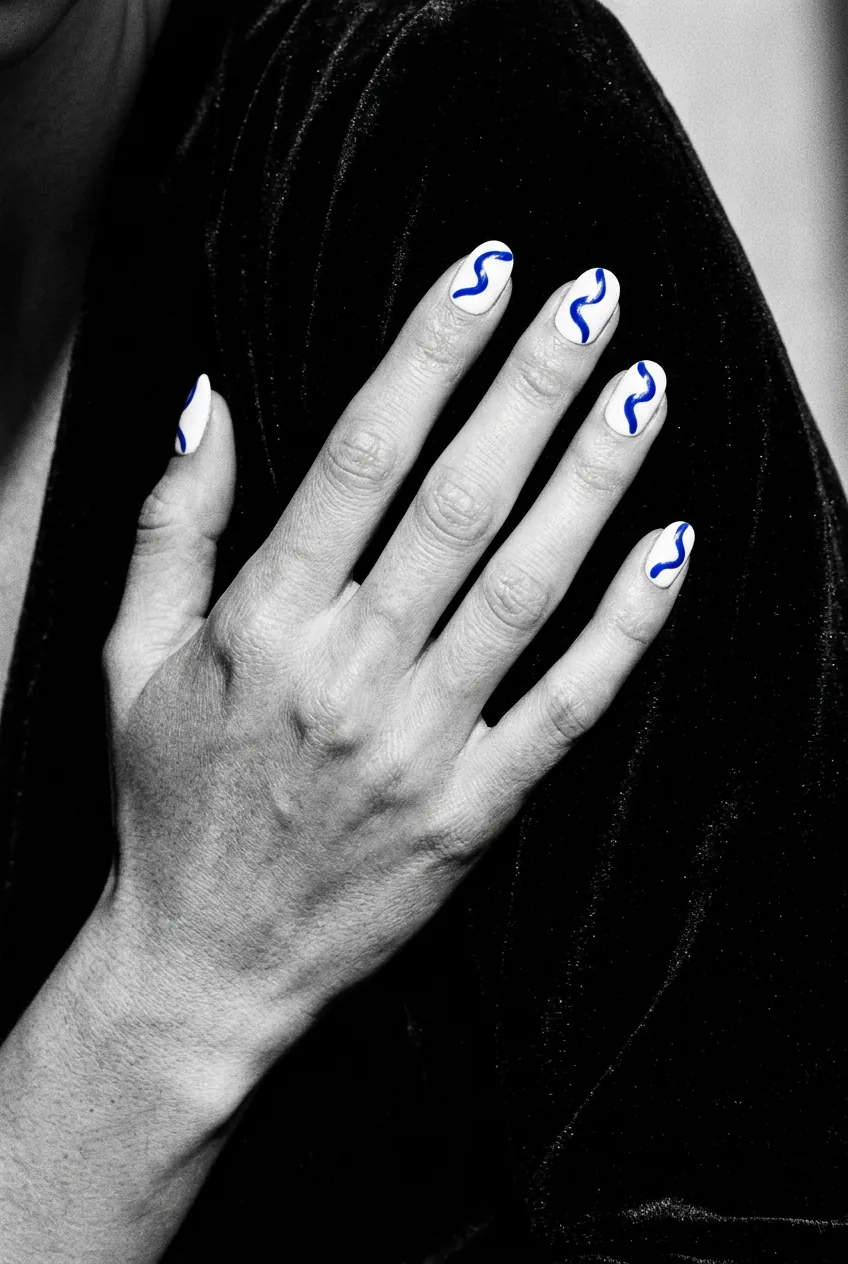
Squiggle nails — those loose, imperfect, wobbly line drawings across a solid base — are maybe the most underrated abstract nail style for photography purposes. The contrast of a single saturated line against a clean background is one of the most legible visual relationships that exists. Your thumbnail could be the size of a postage stamp and you’d still see it.
The line weight matters enormously though. Too thin and it disappears. Too thick and it loses the hand-drawn quality that makes squiggle art charming rather than clumsy. I’d recommend practicing with a striping brush on paper first before going anywhere near a client’s nail — there’s a reason good nail line work is considered a real skill. You can start developing that skill with some solid freehand foundations if you’re newer to the technique.
10. The Metallic Foil Fragment (Catches Light in Weird, Beautiful Ways)
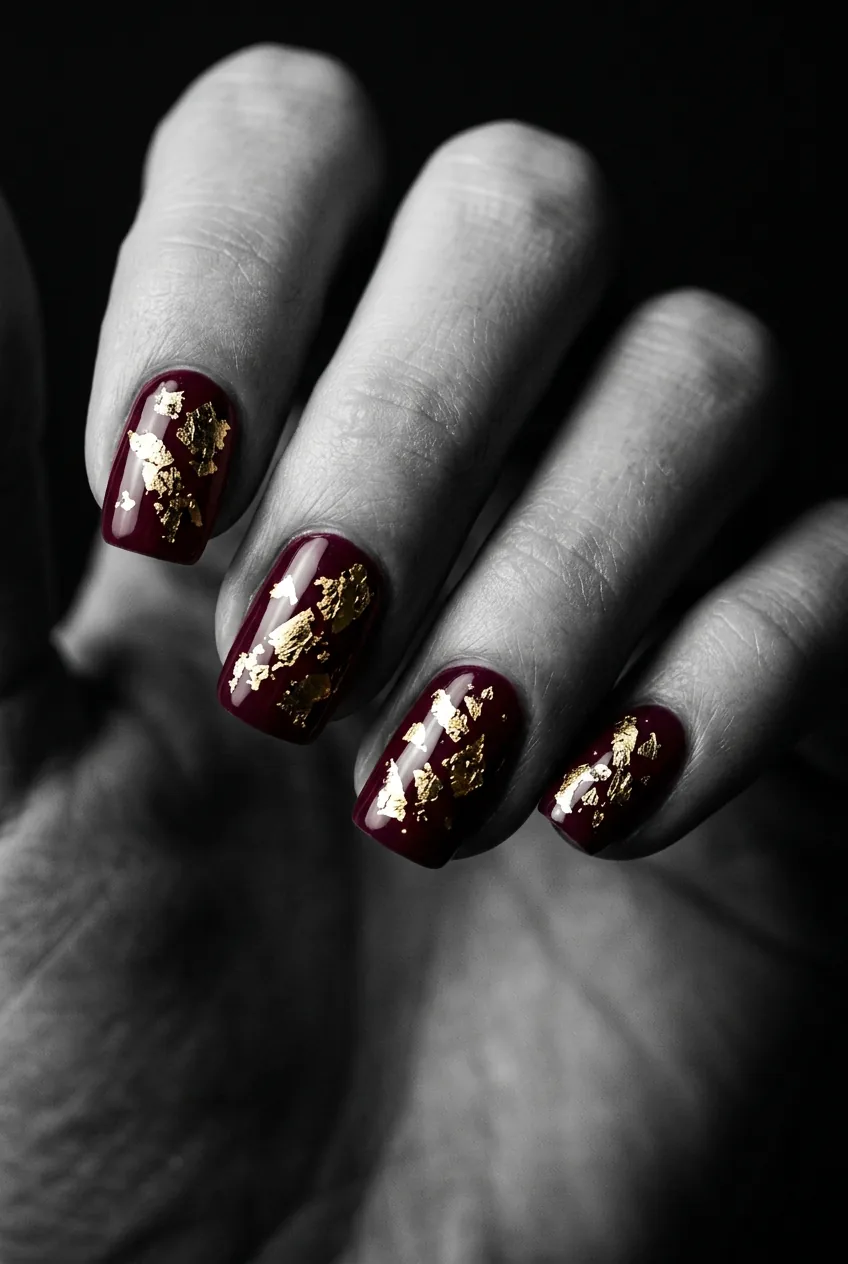
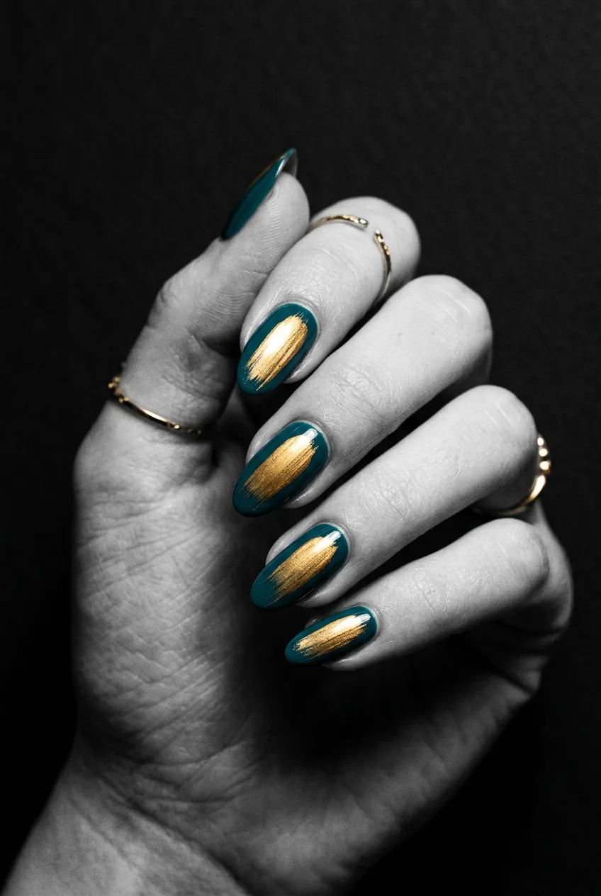
Foil fragments — irregular pieces of gold, silver, or holographic foil pressed into gel in abstract arrangements — behave completely unpredictably under camera light, and that’s exactly what makes them so interesting to photograph. Every shot is slightly different. Move the hand a millimetre and the foil catches a new angle.
She’s got her hand tilted just slightly toward the light source in this shot, and look at how that brings three or four of the foil fragments into sharp, bright focus while the others recede. That variation is what gives foil nail photos a quality that feels almost three-dimensional even on a flat screen.
The doesn’t-photograph-as-well-as-you’d-think warning: very dense, all-over foil coverage that covers the entire nail. When there’s foil everywhere, the eye doesn’t know where to go and the photo reads as chaotic rather than intentional. Strategic placement — abstract clusters, a scattered diagonal, a concentrated zone — always photographs better than maximum coverage.
11. The Monochrome Geometric (The Nail That Never Needs a Filter)
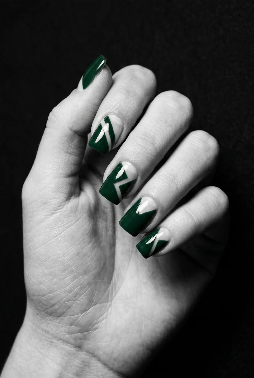
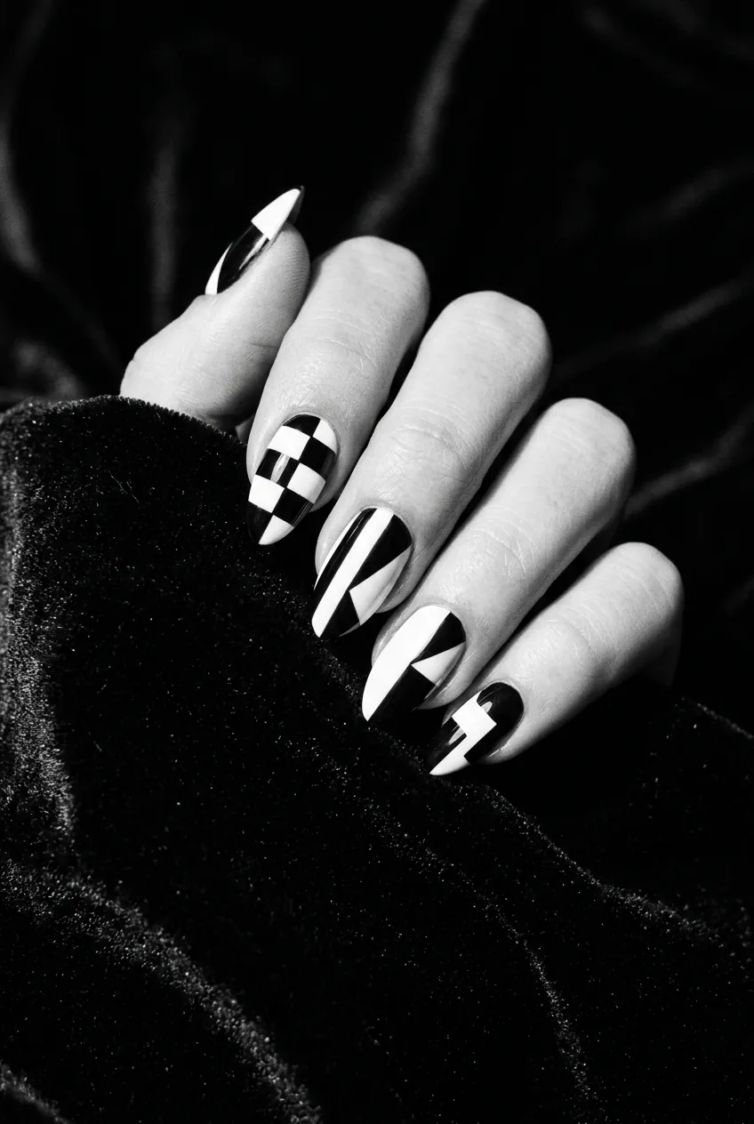
Black and white. Hard edges. Abstract geometric shapes — triangles, irregular polygons, asymmetric blocks. This combination is almost immune to bad photography conditions. Low light? Still reads. Overcast day? Actually looks better. Flash? Bring it. The high contrast does all the work the camera would otherwise have to struggle with.
For this design, nail shape matters more than almost any other style on this list. A monochrome geometric on an almond nail creates a tension between the soft shape and the hard geometry that is genuinely beautiful on camera. The contrast of form against form. On a short, square nail it’s more graphic — which can also be wonderful, just a different mood entirely.
Understanding what makes geometric nail art work on different nail shapes is worth exploring through some solid nail art design references before you commit — the proportions of the geometric shapes need to be considered relative to the nail length and width, or the whole thing can look accidentally random rather than deliberately abstract.
Questions I Get About This
Do abstract nails have to be done by a professional to photograph well?
Not always — but precision matters more than technique level. Some of the most photogenic designs on this list (squiggle line art, the brushstroke swipe) are genuinely doable at home with practice. The issue isn’t who does them, it’s whether the edges are clean and the contrasts are deliberate. A wobbly line is beautiful if it’s confidently wobbly. An accidental edge is ugly regardless of who made it.
What nail length works best for abstract designs on camera?
Medium to long nails give the design more canvas and tend to read better at thumbnail size — there’s simply more visual real estate for the pattern to exist on. That said, minimalist abstract designs like the negative space line and the monochrome geometric look incredibly sharp on shorter nails. The design should fit the nail, not fight it for space.
Does nail shape affect how abstract designs photograph?
Yes, genuinely. Round and oval shapes soften geometric designs and give them a gentler feel on camera. Almond and coffin shapes add drama to the same design. Square shapes emphasize clean lines and graphic elements. I’d say nail shape is the second most important decision after the design itself — they work together or they fight each other, and the camera makes the result very obvious.
What lighting is best for photographing abstract nail art?
Dramatic side light — the kind that rakes across the nail surface and catches texture and gloss — is my favourite for abstract nails. It’s what you see in editorial nail photography for a reason. Harsh overhead light flattens everything. Diffused window light is beautiful for watercolor and gradient styles. Ring light is fine but it creates a circular reflection that can feel clinical. Experiment with the light source off to one side and see how much more dimensionally your nails read.
Right — that’s everything I’ve tested, argued about internally, and photographed more times than I’d like to admit. If you take nothing else from this: the camera rewards contrast, gloss, and intention. Abstract nail art that photographs beautifully isn’t necessarily the most complex or the most expensive — it’s the most considered. And honestly, that’s a pretty good rule for most things.
Go make something weird and beautiful and see what the camera thinks.